Graphic Design Work
My work in the Design & Media program explores storytelling through design, where concept, motion, and narrative come together. From storyboarding and video campaign design to logo systems, book layouts, and motion graphics in After Effects, each project begins with an idea and evolves through intentional visual choices.
I’m drawn to projects that translate stories into systems by building worlds through branding, shaping ideas through motion, and guiding viewers through a visual experience from start to finish. These selected projects represent my most meaningful work from the Design & Media minor and reflect my approach to design as both a creative and storytelling tool, balancing aesthetics, clarity, and emotional impact.
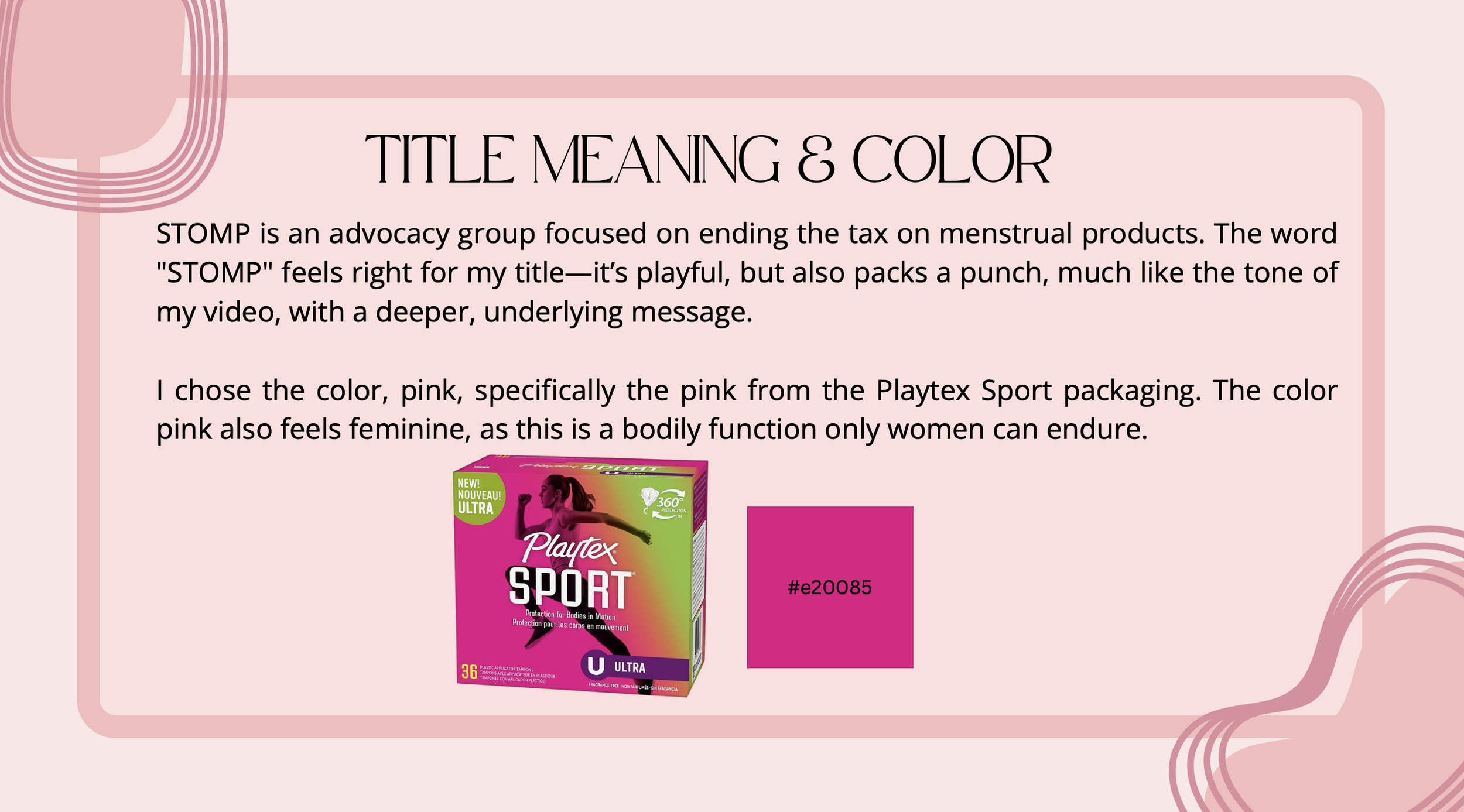
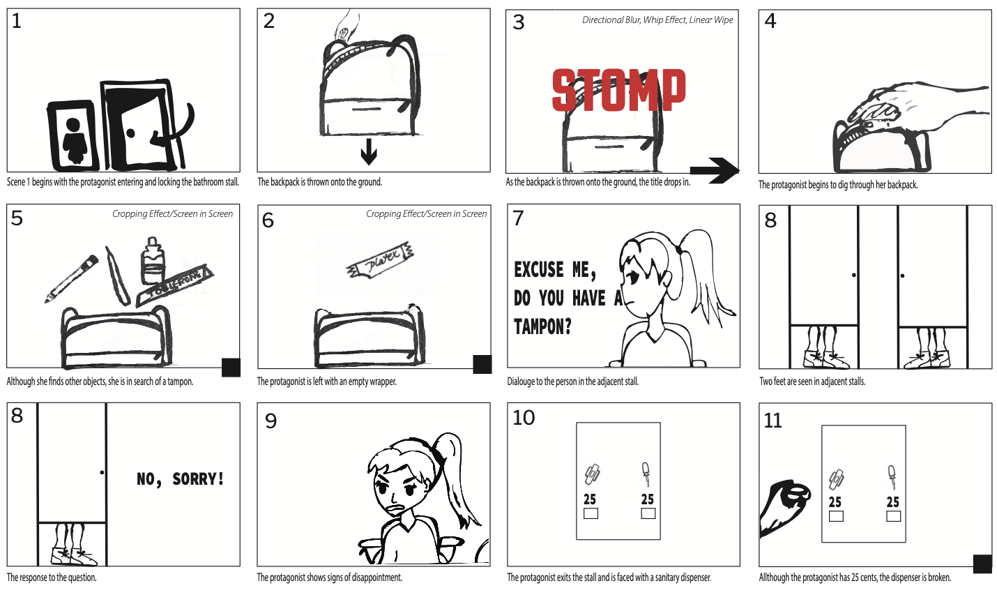
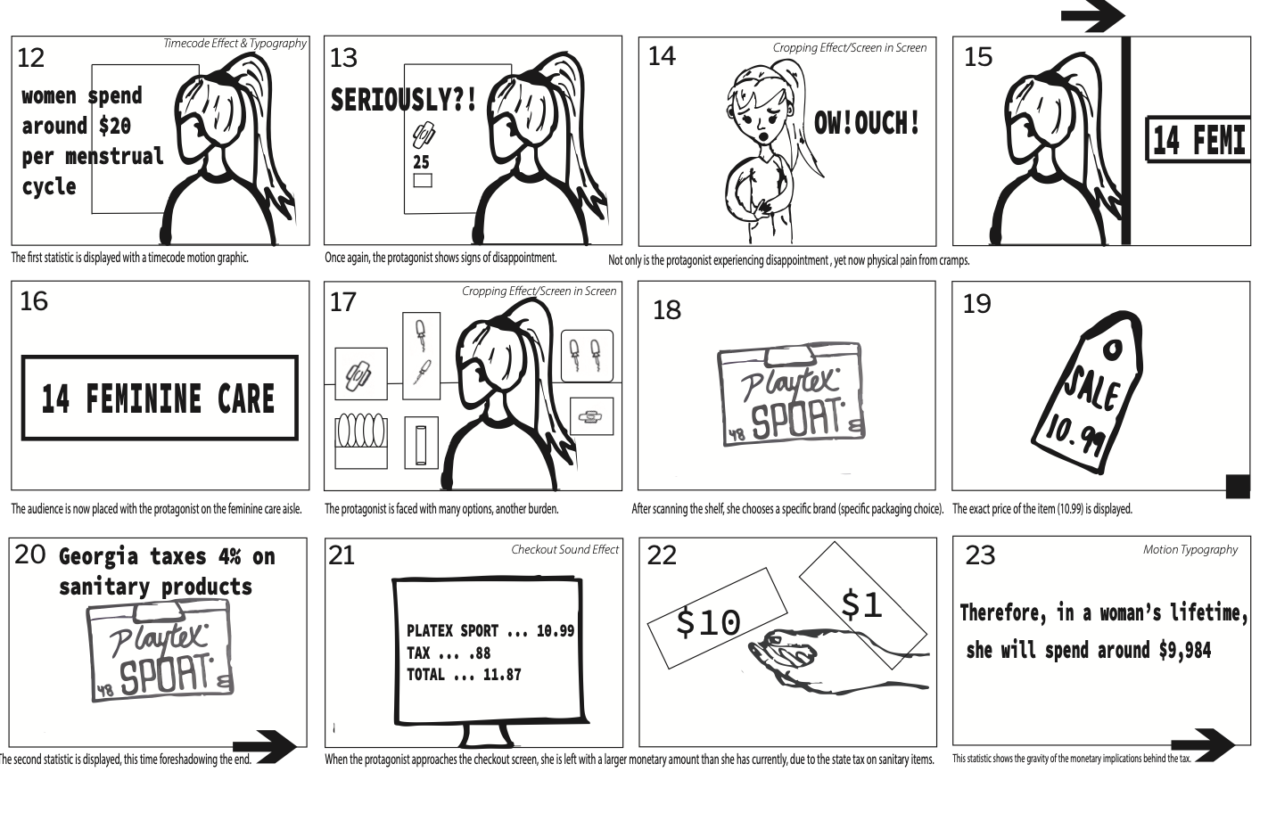
To our government, tampons, pads, or menstrual cups are considered “luxury goods” and taxed accordingly. But is it really a luxury for women? From the awkward moments of asking for a tampon under the stall to dealing with cramps and broken vending machines—do we really need another barrier, especially a financial one?
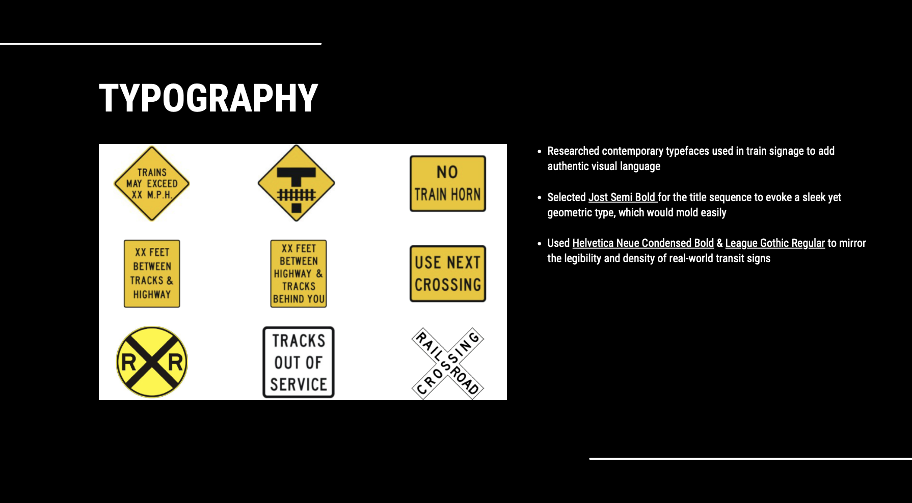
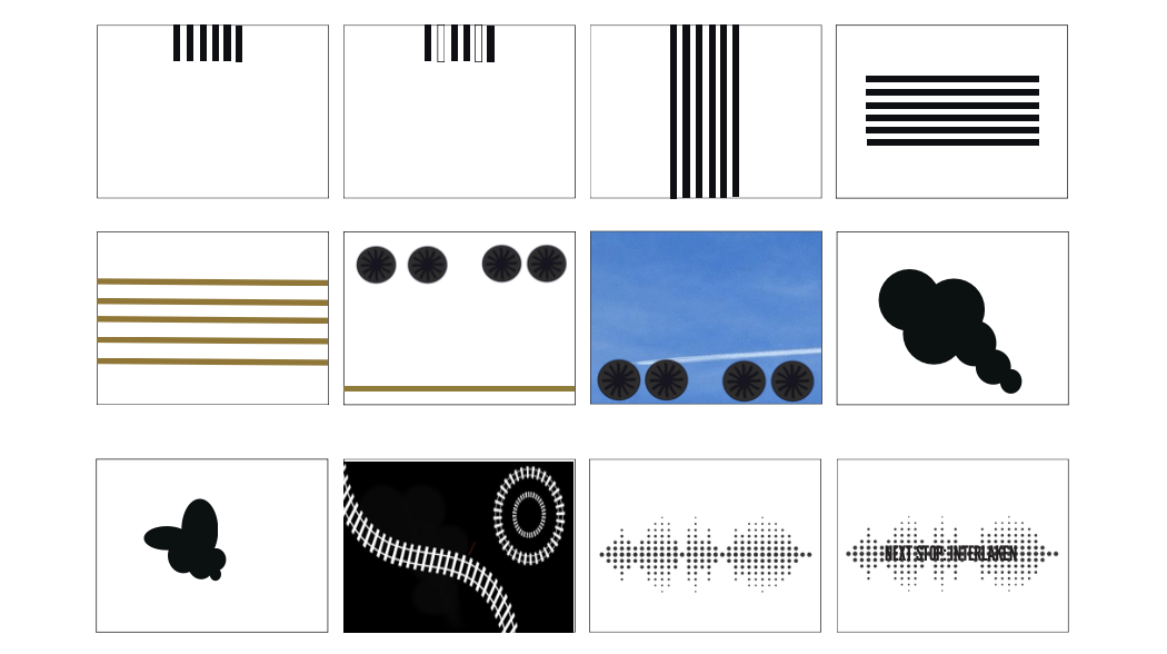
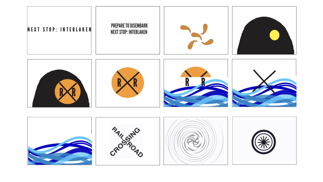
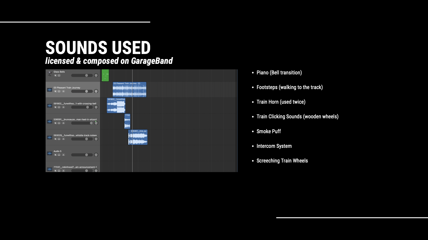
This project was built around the idea of making the invisible visible. Rather than showing a train outright, I chose to represent it through segments — the sounds, the shapes, the motion. Each element, from the piano keys which build into wheels to the rhythm of wooden tracks, acts as a clue. The viewer will experience this journey through abstraction, rather than a literal depiction. The result is a visual and auditory composition which emphasizes how many peices make up a whole.
Prescription drug abuse has become a pressing public health issue in the United States. The misuse of medications, especially opioids, benzodiazepines, and stimulants, has contributed to a dramatic rise in addiction rates and overdose deaths over the past two decades. As someone who relies on anxiety medication to manage my emotions and stress, I often wonder: without this pill, who am I? Or, am I simply defined by it? In this collection of one hundred images, I aim to explore the darker side of taking pills. While their diverse cylindrical shapes can be visually striking, the accompanying warnings about overdose and addiction cast a shadow. The book begins with a visit to the drugstore, followed by a weekly, structured routine represented by a pill box. However, after a chapter focused on this schedule, readers will experience a shift in tone, leading them down a rabbit hole that delves into the complexities of dependence on prescription drugs. What does taking one extra pill look like?
I embarked on an exploration of pill colors and shapes, delving into their visual appeal and purpose. Analyzing various packaging designs, I experimented with how form and color interact to
convey messages and evoke emotions. Focusing on two powerful keywords—“warning” and “caution”—throughout the book allowed me to deepen my exploration and transform words into striking visuals. My intent was to provoke a sense of unease regarding these everyday medications.
The result is a vibrant collection that not only celebrates the aesthetic qualities of familiar objects but also prompts readers to reflect on their own consumption habits.
Logo Redesign: SONIC
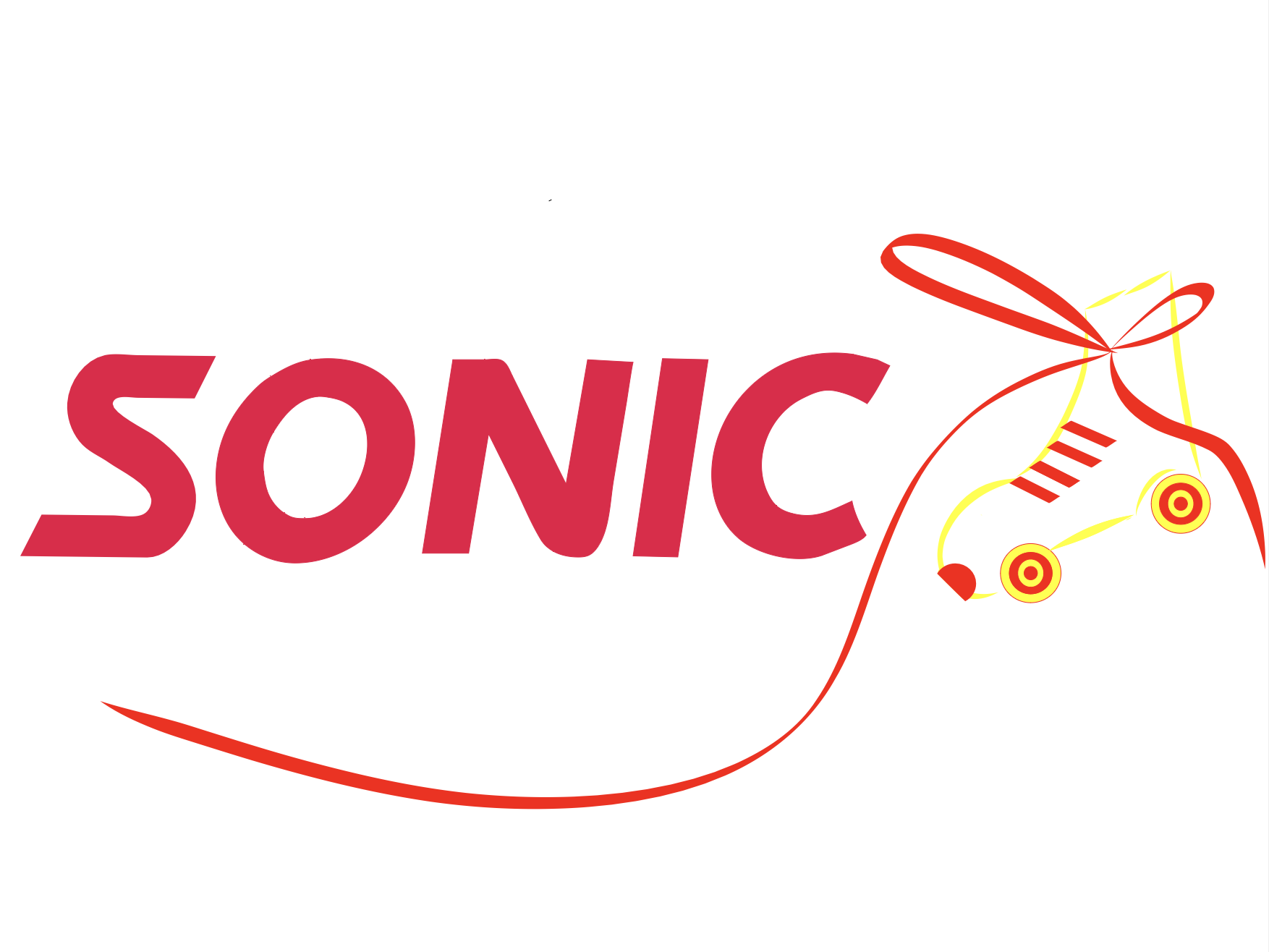
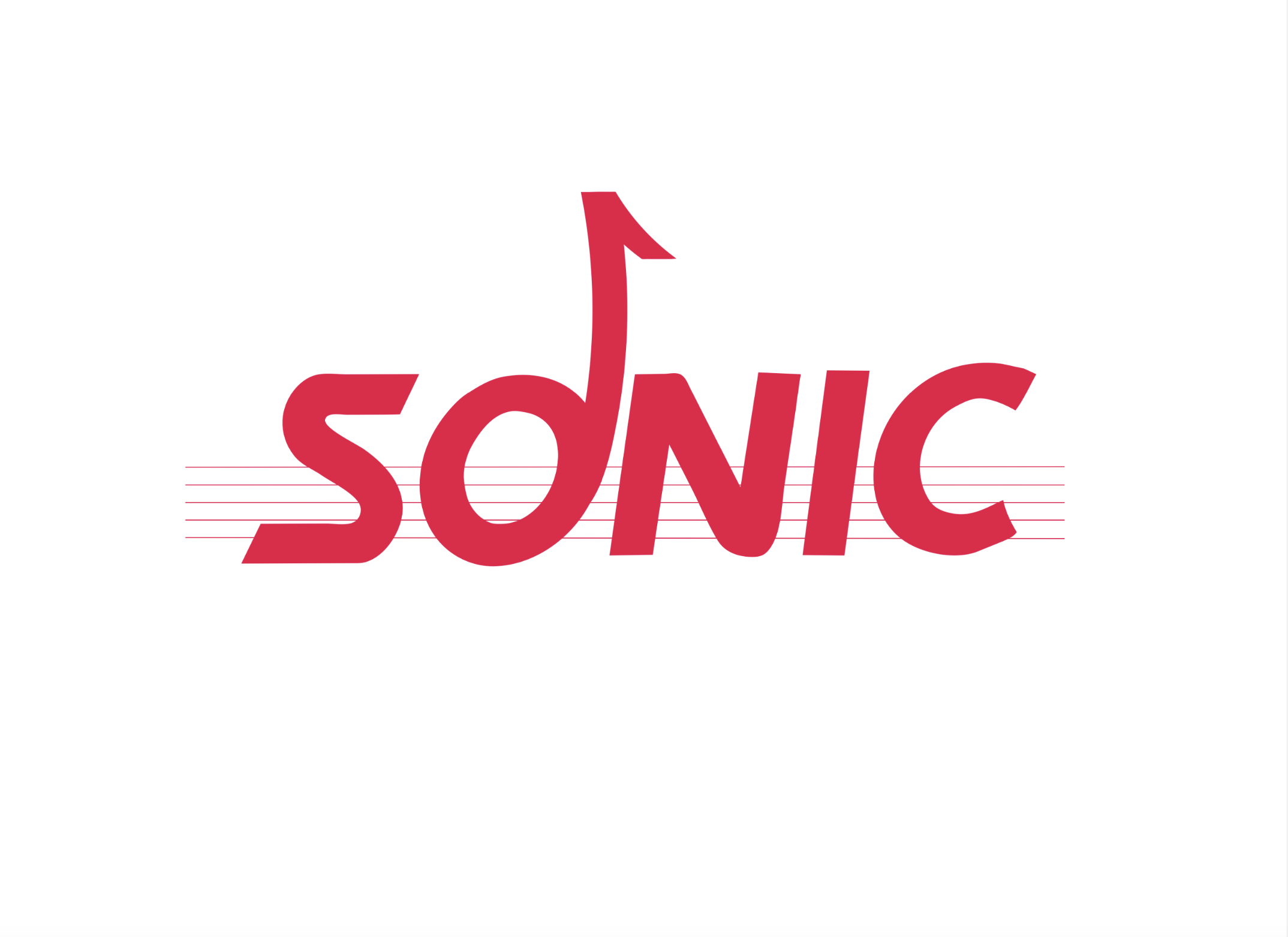
The Sonic logo has evolved from a dynamic, speed-focused mark to a simplified billboard-style design that lacks clear meaning. Earlier versions used red and yellow to suggest speed and stimulate appetite, while the current cooler red-and-blue palette can feel appetite-suppressing and visually disconnected from the brand’s identity. While the simplified logo improves legibility, it no longer communicates what makes Sonic unique. In my redesigns, I preserved Sonic’s signature typography and vibrant red while refocusing the logo on the meaning of “sonic” and the brand’s distinctive drive-in experience.
My first redesign draws from Sonic’s original service tradition of roller-skating carhops, emphasizing both efficiency and personality. The hand-drawn roller skate references “service at the speed of sound,” sparks curiosity, and reinforces brand nostalgia. I simplified the skate for flexibility, reintroduced yellow accents to complement the hunger-inducing red, and enlarged the typography for clarity and impact.
The second redesign interprets “sonic” through sound and music. Inspired by sound waves, I incorporated an eighth note formed from the “o” and subtle staff lines in the background. The minimal, monochromatic approach keeps the bold “sonic” text as the focal point while allowing the symbolism to unfold upon closer viewing.